Tips and tricks: Scientific Figures

|
|
Types of display items Different types of display items are used in scientific contributions. The most used are figures (graphs), which are tackled within this section. In addition, flow charts can be used to highlight distinct steps of a process. Finally, schematic representations (such as graphical abstracts) are used to visually summarize scientific results. The latter types can be nicely conceived using PowerPoint as is demonstrated in another section.
|
|
|
|
DestinationFrom the earliest point on, it goes recommended to keep the final destination of your figure into account. Most commonly this is in a two-column scientific article. Accordingly, ensure that the below mentioned concerns on readability apply to the right size. It may be required to redo figures after the destination changes (for example, when re-using article-style figures for your single-column thesis).
|
|
|
Single or double column widthMost commonly, figures are displayed within one column of a two-column A4-sized page. However, also compositions of various figures can be squeezed into a single column. The determination of the final size is done, after your paper is accepted of course, by the page setter. Page-setting is a process executed by a third party (often in India), of which we have little control. It is accordingly important that the lay out of your figure clearly dictates how it should be included in your article. Take notice that, out of page economy, the amount of wide doubled-column sized figures is limited...
|
3D, really?3D type graphs can look pretty amazing. The problem is that they do mostly when you have the option to rotate them (as on your PC). sadly, once printed on paper, they can be a lot harder to read and actually inhibit deriving the accurate values (the primary task of a figure)! A typical example here on the right. IMO, on paper: stick to 2D!
|
|
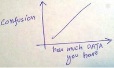
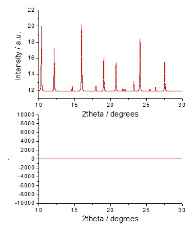
ScalingEspecially, when unfamiliar with a certain type of data, it can be hard to plot them on the right scale. After all, everything will yield a horizontal line if plotted on the wrong scale (see example on the right). Accordingly, to prevent surprises, make sure you know on beforehand what the expected scales are. The right scales you may acquire from talking to people or reading on-topic literature.
|
|
|
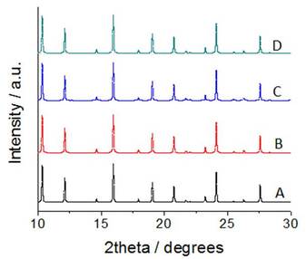
LabelsPutting labels (here: A-D) on the actual data is a great help to facilitate the interpretation of your data, as it makes repetitive reading of the caption obsolete. However, out of space economy (see below) and clarity: choose their position wisely. When using symbols, you can also opt for using a legend. Though it is always a bit case-specific, IMO is preferred: label on data > legend > explanation in caption.
|
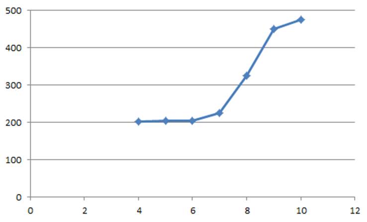
Space economyUnless it is of crucial value to highlight the absence of data/signal in a certain domain, showing empty graphs is usually poor use of paper. For example, the graph on the right would look more insightful when plotted (on y-axis) from 200, and (on x axis) from 4. By removing the 'dead volume' of your graph the readability of your data improves.
|
|
|
Consistency and templatingYour graphs will look best consistent throughout your contribution. Accordingly, it may be wise to optimize the look of one specific figure and apply it to the others. Hell, you may even develop your very own 'style'! Using a fixed template can be a great help here: simply copy the graph, replace data (adjust a bit where needed), and there you go!
|
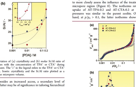
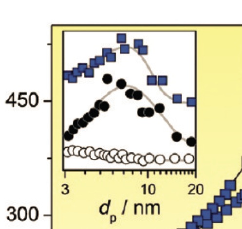
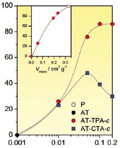
InsetsInsets can be a nice way to use 'dead volume' in your graph to highlight trends of secondary value. Make sure that the scale and axis title can be properly read and that the symbols are big enough. Often simply making a standard graph 5 times smaller yields font sizes and symbol sizes that are hard to read...
|
|
|
Arbitrary units 'a. u.'Arbitrary units are often used when the exact value of the y-axis is of secondary importance (as can be the case for results derived from techniques as FTIR, XRD, and NMR). However, always check whether this is truly the case.
|
ColoursMany publishers (Elsevier and ACS, for example) will gladly publish your graphs and figures in colour. However other publishers (such as Wiley) do not do so that willingly (they ask for ca. 500 euro per figure!). Using colours is a nice way to make your data look even nicer. However, make sure that in the printed form (b/w) it is still readable! Also, when printing a thesis: colour cost 5-10 times more than standard b/w pages...
|
|
|
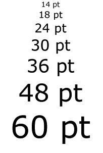
FontIn making scientific figures, it is recommended to stick to the arial font. In font size you are more free. It is useful to check on before hand, by printing on the correct scale for example, that the font sizes you aim to use are readable and look good. Ask your colleagues for their opinion.
|
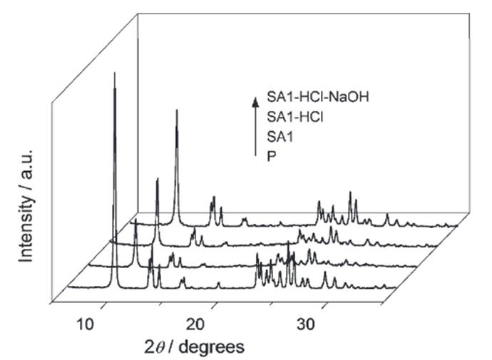
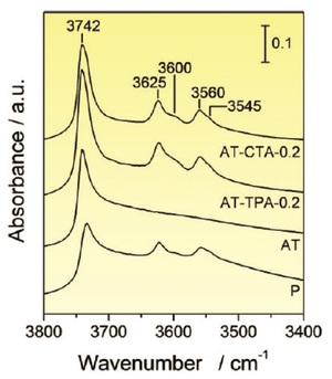
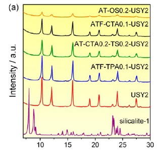
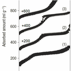
Stacking and offsetsStacking can be a useful way to separate data that would otherwise overlap (see right). It is done by simply adding a constant value (off set) to a given data set. However, although the curves are now nicely separated, readability of the actual data (as was measured) becomes much harder as you have to deduct this value. Therefore, unlike done on the right here, I would recommend stacking primarily for data sets in which the absolute value of the axis is of secondary importance. The latter is usually the case when arbitrary units are used. Multiple graphs on this page serve as example.
|
|

|
Program: Origin, Excel, Matlab, etc.The plotting program usually does not matter too much: each to his own. Personally speaking, I know that Origin has some nice options. An advantage of working with Excel is that it is widely available, and it is easily to incorporate graphs as vector graphics in word documents. The latter ensures very sharp printing, much appreciated for printing your thesis.
|
Data limitAside from showing that everything is the same, it is usually counterproductive to add too much data sets in a single figure. Especially if the data is not stacked, it is recommend to limit yourself to 3 or 4 data curves in the same figure.
|
|
Trend lines Trend lines are a great tool to emphasize the trend (you think you see) in your data. Trend lines do not represent actual data and can therefore be added as you prefer. However, do not get too carried away as you are likely to make a fool out of yourself :) Trend lines can be made using any program. For example, as illustrated in the Arts/Images section ('edit points'), PowerPoint enables to make some sweet trend lines...
|
|
|
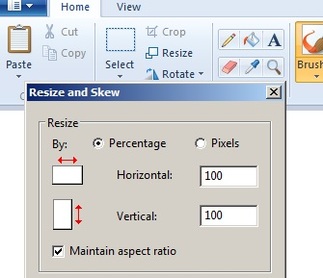
Converting a figure to high-res '.jpg'Converting graphs into high-res jpgs can be a bit of an ordeal and you may need to play a bit to find out what works best for you. I usually copied my Origin graphs to PowerPoint. There I would add the labels and trend lines. Next,I would select all and save the objects as 'emf'. This emf file I would then open in Paint (optionally resize), and then save as jpg.
|
Further readingUpdate I: for an publishers view on figures, check out the ACS style guide chapter by Betsy Kulamer:
Update II: for a more fundamental view on the value of figures, check out the very insightful work by Edward Tufte:
Update III: for more technical insight on making suitable resolution figures check out the article by Dr. B. Nanes:
Update IV: for more tips on figures (and scientific communication in general) check out the work by Marta Davis:
| ||||||||